Flexpress Services, Uncategorized
Making Your Message Pop: Typography Essentials for Custom Poster Design
Dec
Typography isn’t just about choosing fonts; it’s an art that can elevate your custom poster design to a whole new level. But before delving into the intricate world of fonts and typography, let’s address some pressing questions about printers and their role in bringing these designs to life.
Which Printer is Commonly Used at a Corporate Office?
In a corporate setting, printers often need to handle various tasks efficiently. Laser printers are a common choice due to their speed, reliability, and ability to handle high volumes of printing. These printers excel in producing crisp, professional documents, making them ideal for office use.
What Type of Printer is Best for Commercial Use?
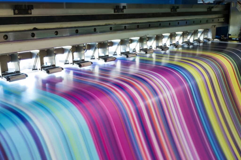
Commercial printing demands speed, quality, and versatility. Digital printers, especially high-speed digital presses, are often the go-to choice for commercial printing. They offer quick turnaround times, high-quality outputs, and the flexibility to handle various paper types and sizes, catering to diverse printing needs.
What Printer Do Printing Companies Use?
Printing companies rely on robust and versatile machines to match the multiple needs of their clients. Offset printers are widely used in printing companies for their ability to produce large volumes of high-quality prints consistently. These machines are known for their precision and are ideal for projects requiring sharp, detailed imagery.
Now, armed with an understanding of printers commonly used in different settings, let’s dive into the world of typography—a critical aspect of creating captivating custom posters.
Typography Essentials for Captivating Custom Posters
1. Font Selection: Choose fonts that align with your brand’s personality and the message you want to give. Play with font styles—serif, sans-serif, script, or display—to create visual interest and hierarchy in your poster design.
2. Readability Matters: Ensure your chosen fonts are easily readable, especially from a distance. Poster designs often require larger font sizes to grab attention, so prioritize legibility without compromising on style.
3. Hierarchy and Emphasis: Use typography to establish a visual hierarchy. Play with font sizes, weights, and colors to emphasize key information. The headline, subheadings, and body text should guide the viewer’s attention seamlessly.
4. Balance and White Space: Strike a balance between text and negative space. White space allows your typography to breathe, enhancing readability and visual appeal. Utilize it effectively to direct focus and maintain a clean, uncluttered look.
5. Experimentation and Creativity: Don’t shy away from experimenting with typography. Mix and match fonts, try unconventional placements, or incorporate custom lettering to infuse personality and creativity into your poster design.
Explore Unparalleled Business Printing Solutions with Flexpress!
Flexpress sets a new standard for excellence in business printer solutions. Through our leading-edge technology and unmatched proficiency, we guarantee superior quality in every single print. Whether it’s tailored marketing materials, eye-catching signage, or unique stationery, our state-of-the-art presses ensure accuracy and vividness. Committed to innovation and consistently surpassing expectations, selecting Flexpress equates to opting for unmatched reliability and quality in every printing project. Step up the quality of your prints—partner with Flexpress today!